Business Professional
The end of the semester was crazy and I had to focus on my priorities, thus my blog got dropped. However I (almost) always took pictures of each manicure I did, so you will get to see them all.
Other than school, one of my priorities was interviewing for full-time jobs (since I will be graduating in May). The job search is like a part-time job in itself (on top of school and my actual part-time job), except I don’t get paid for all the time and effort involved. AND the really tragic part is when I go to interviews I have to make sure my nails look professional. I don’t want to ruin the effect of wearing a suit by having Franken-monsters on my nails!

Nine West suit, $30. I love thrift stores.
I started out with solids, but given all the interviews I was going to, I eventually started to branch out. I’d probably go a little (more) crazy if I couldn’t have interesting nails! The rest of this post shall consist of the nails I did over the past 5 weeks that I felt were interview-appropriate.
First up, a classic french manicure. I actually hate french manicures, as I find them to be exceedingly boring. Plus, given how often I paint my nails, they are constantly stained yellow on the tips. (It’s pretty gross looking). To do these, I had to try one of the nail whitening products I have purchased over the years. It worked relatively well, actually. I took pictures of the process, so I’ll be reviewing the whitener in another post. Regardless of my dislike for french tips, they turned out quite well and almost look like professional acrylics.
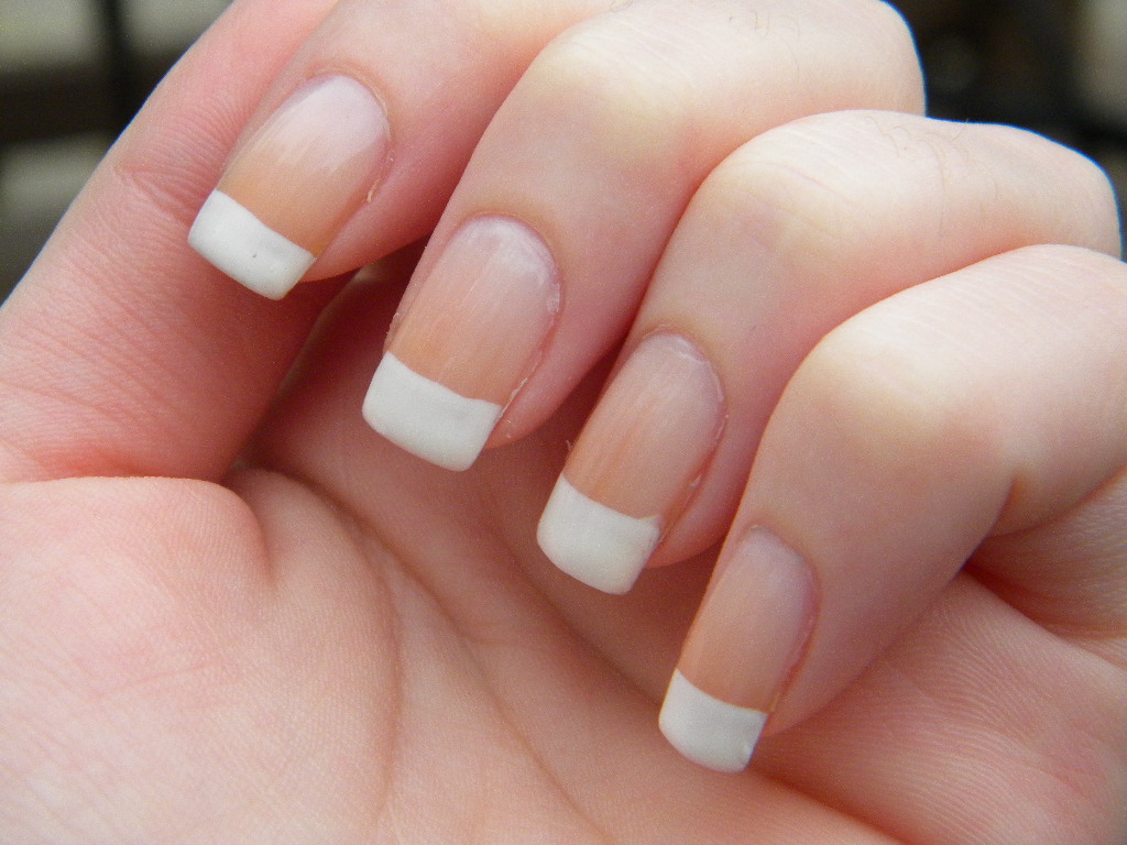
If I didn’t know better, I’d assume these were my mom’s press-ons.
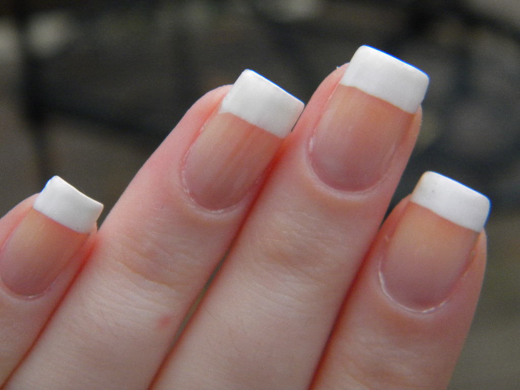
Seriously, they look ridiculously fake.
Next up, I used one of my favorite stamps, a full-nail stamp that looks like a page of music. Stamped a pale gold on top of a very very pale pink.
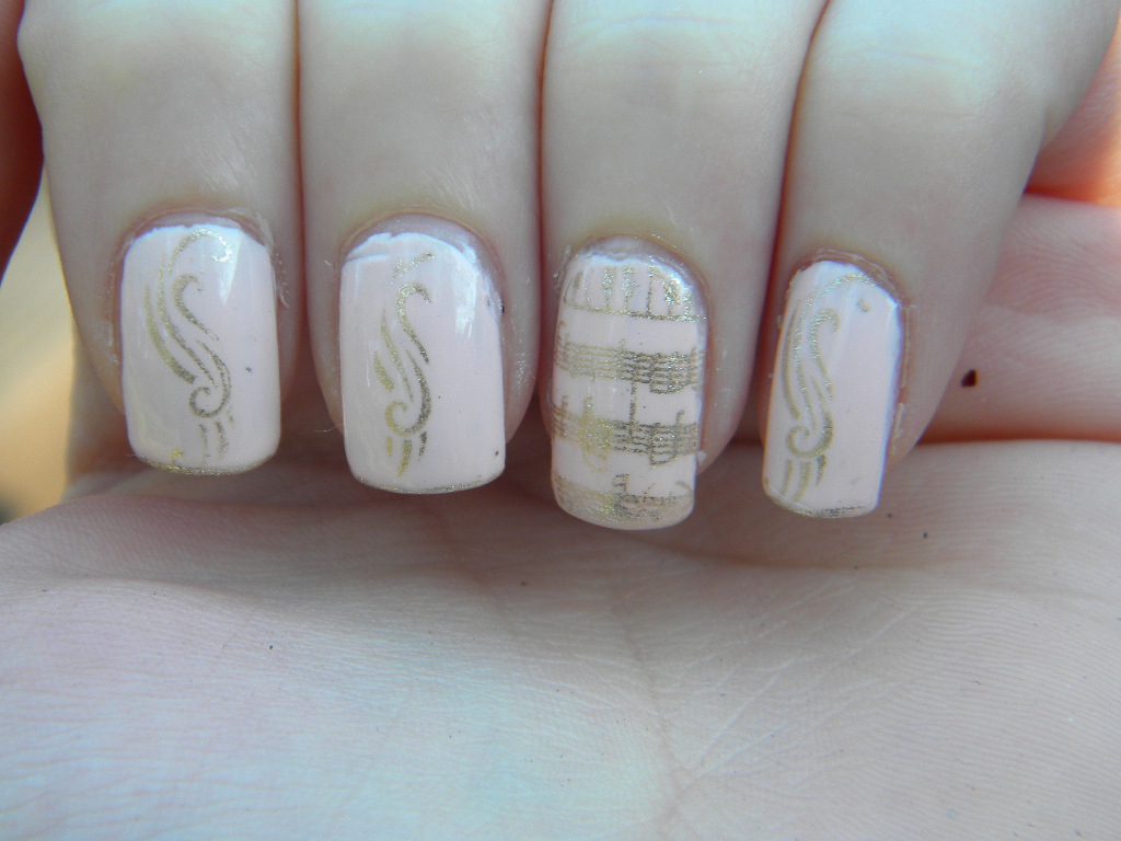
And on the non-accent nails I stamped some swirly thing that looks a little like a treble clef.
I just think of ballet when I see these. The pink is so pretty, but was a terrible formulation. It was that “new” Sinful Colors brand that suddenly started showing up in Walmarts and CVS (and presumably other places, but I only frequent those two). The brand overall is pretty good and has some of the best glitter polishes I have encountered, but the solids are hit or miss in terms of formula. Great colors though. And hard to resist at $2 a pop.
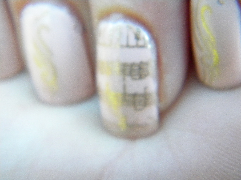
Close-up of the accent nail. When I first got it, I did not think such delicate line would stamp quite so well, but they are perfect.
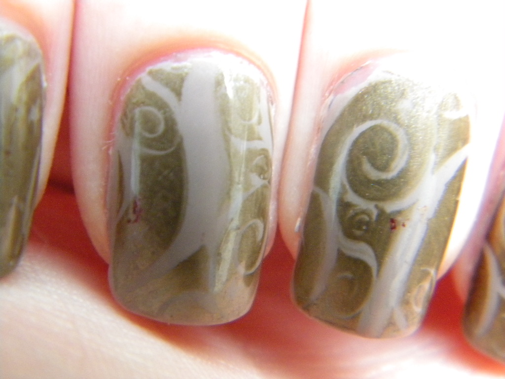
These I actually did not think would be interview appropriate when I first made them, given the prevalence of the gold in the design. But my mom said they looked like Nordstrom or Lord and Taylor so I think they would be quite nice in a professional situation. I’m a little bit in love with both of the polishes in this manicure. Both Revlon, the base is a beautiful, beautiful taupe (that will soon feature in a giraffe print manicure) and the stamped color is the most gorgeous tarnished gold. The gold looks different from different angles, and in the bottle it looks like liquid metal.
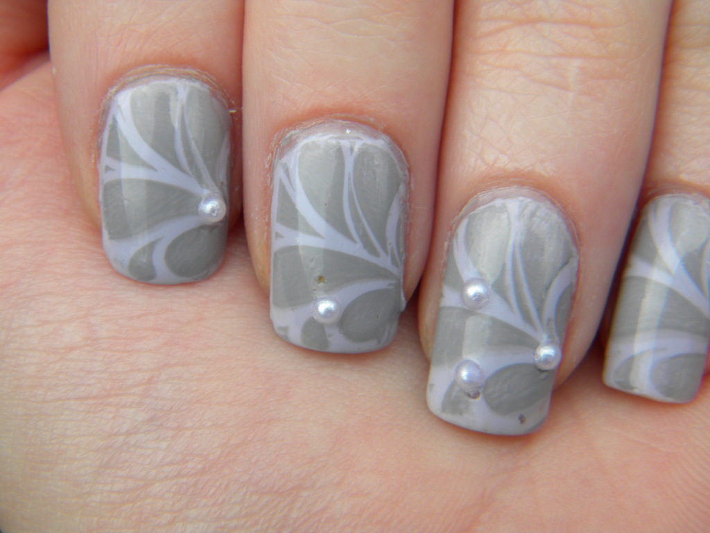
These last ones I actually wore to an interview AND I got the job! (First offer, yaaaaay!). The lilac underneath is gorgeous, but as I found out, does not stamp well. These took quite a bit of trial and error before I found a color combination I liked, but I am very pleased with the result.
I do love 3 dimensional manicures! They feel so weird though.
Sadly, other than the french tips, my professional nails all involve konad stamps. I think that is partially because my heart isn’t really into making such boring creations as it is into painting holiday themed nails or something else more interesting.